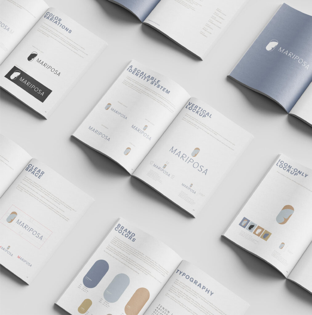
We believe design should do more than look good—it should work. From leasing materials that seal the deal to signage that turns heads, every project we take on is built to connect, convert, and last. We craft bold, strategic branding that helps our clients stand out and their communities thrive.
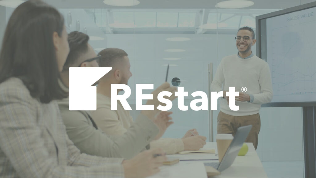
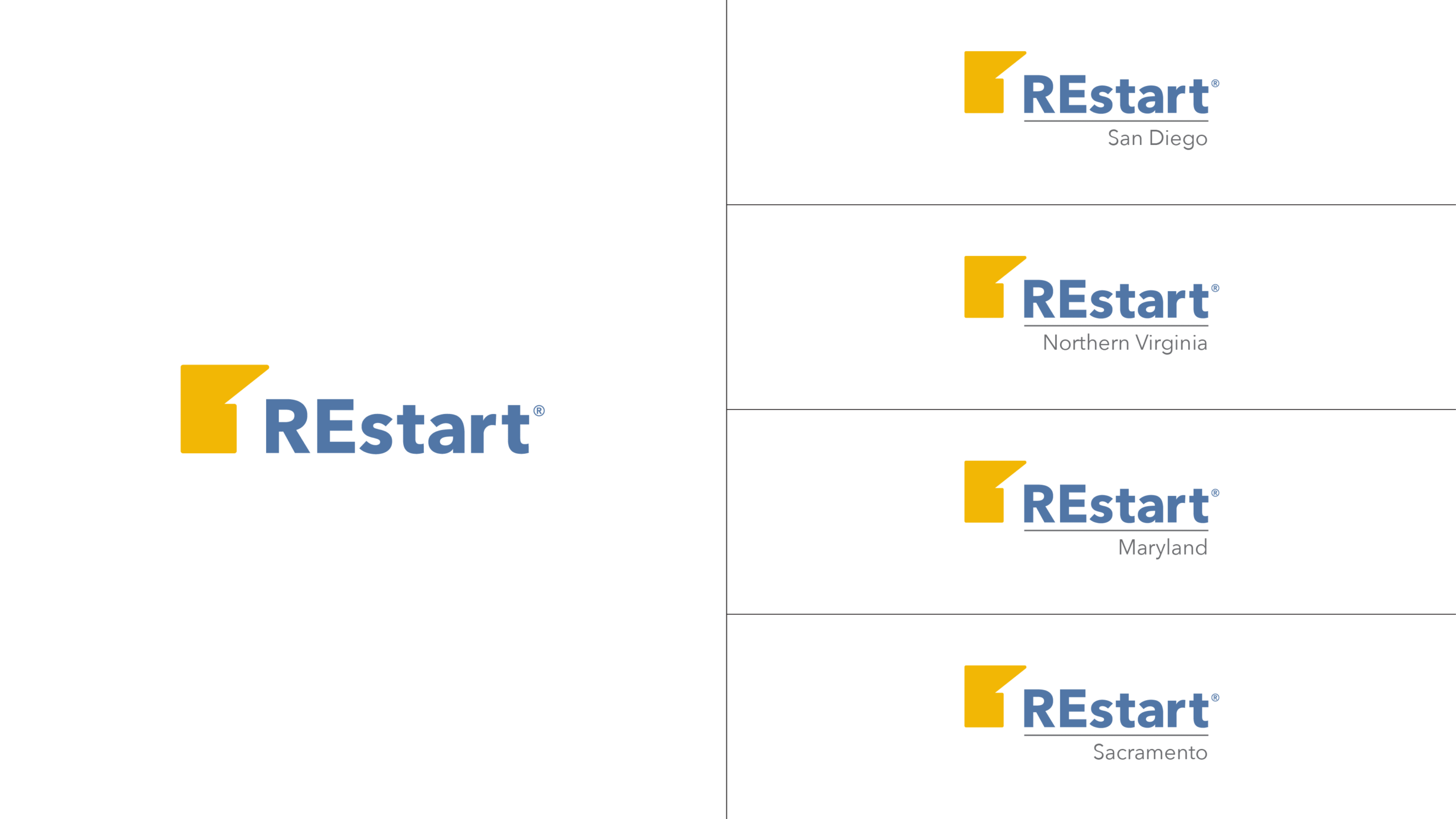
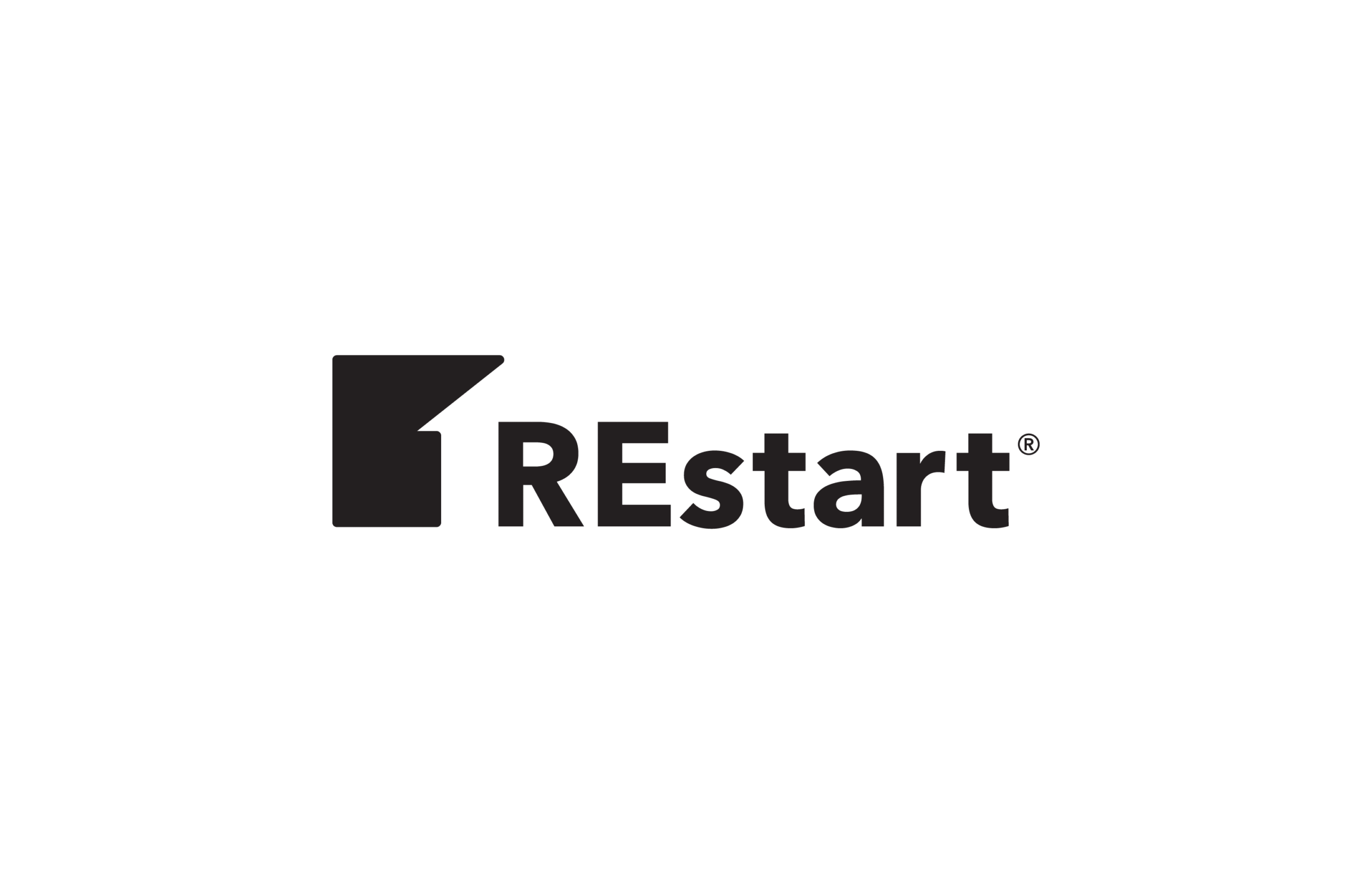
REstart is a national nonprofit helping individuals rebuild their lives through real estate education and careers. Partnering with IREM and the Bobby Jo Lewis Foundation, the program needed one unified identity that reflects renewal, growth, and opportunity.
The Challenge
With each REstart chapter using its own logo, the brand lacked a unified national presence. The goal was to create one cohesive identity that reflected the program’s purpose — empowerment and renewal — while aligning seamlessly with IREM and the Bobby Jo Lewis Foundation.
The Approach
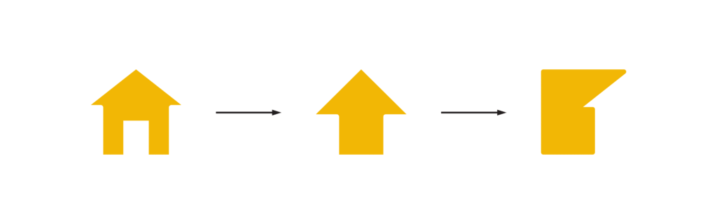
I drew from the visual language of both IREM and the Bobby Jo Lewis Foundation to craft a connected yet distinct identity. The new mark blends symbolism and simplicity — a house and upward arrow hidden in the negative space — representing stability, growth, and fresh beginnings.
The Outcome
The final logo brings every REstart chapter together under one modern, meaningful brand. It reflects progress, purpose, and partnership — a design that feels right at home alongside IREM and the Bobby Jo Lewis Foundation.
Services
Branding Brand Guidelines
Your turn. Let’s create something that stands out (and rents fast).
Let’s bring your community’s story to life with thoughtful design and strategy.
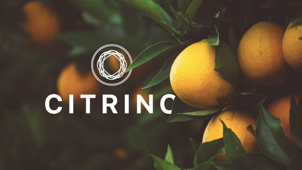
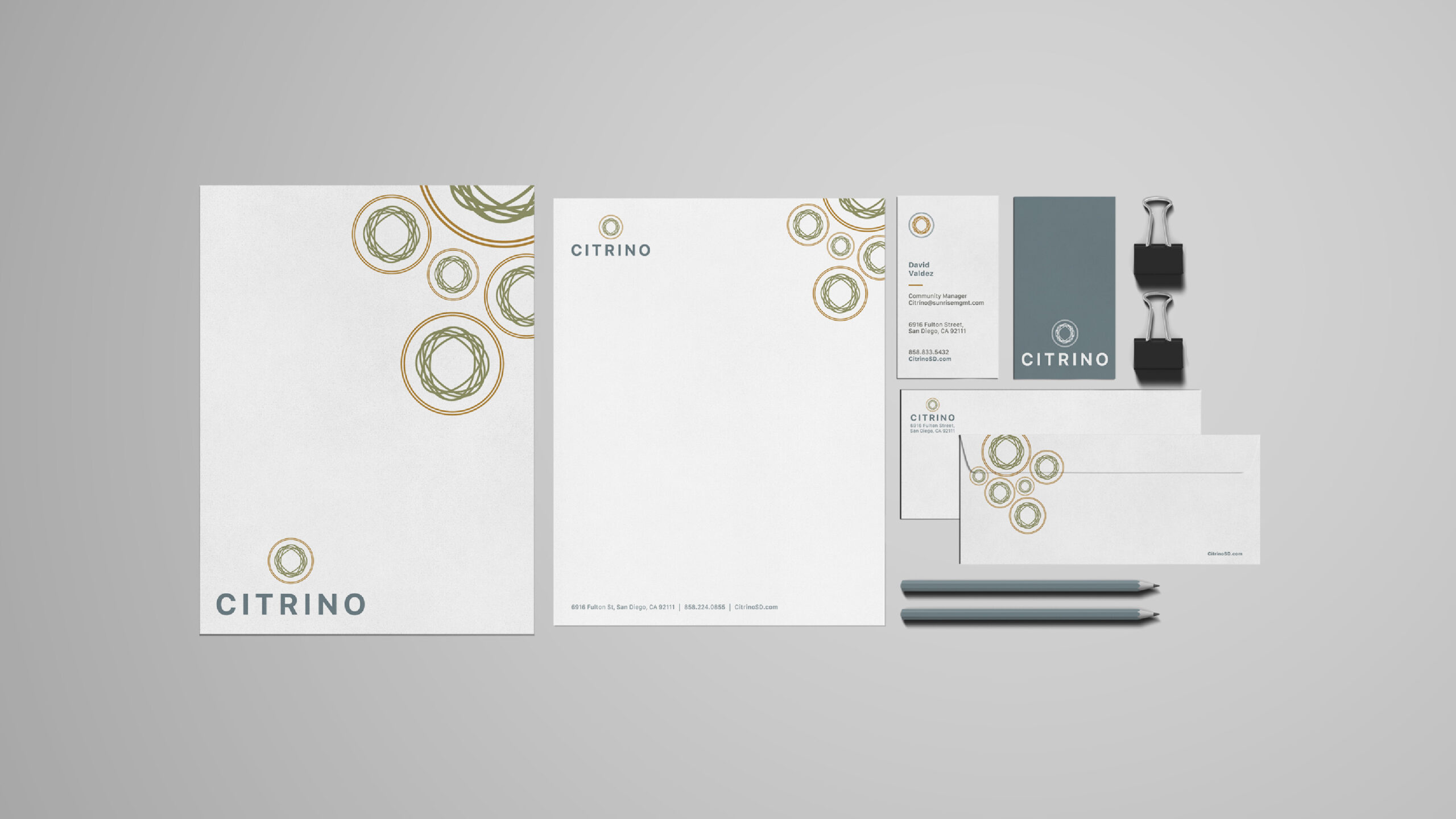
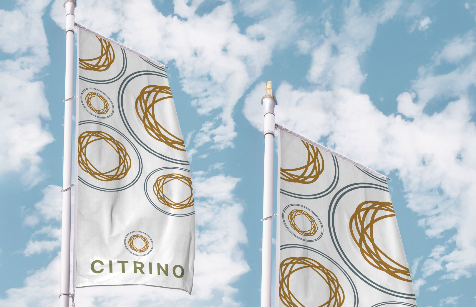
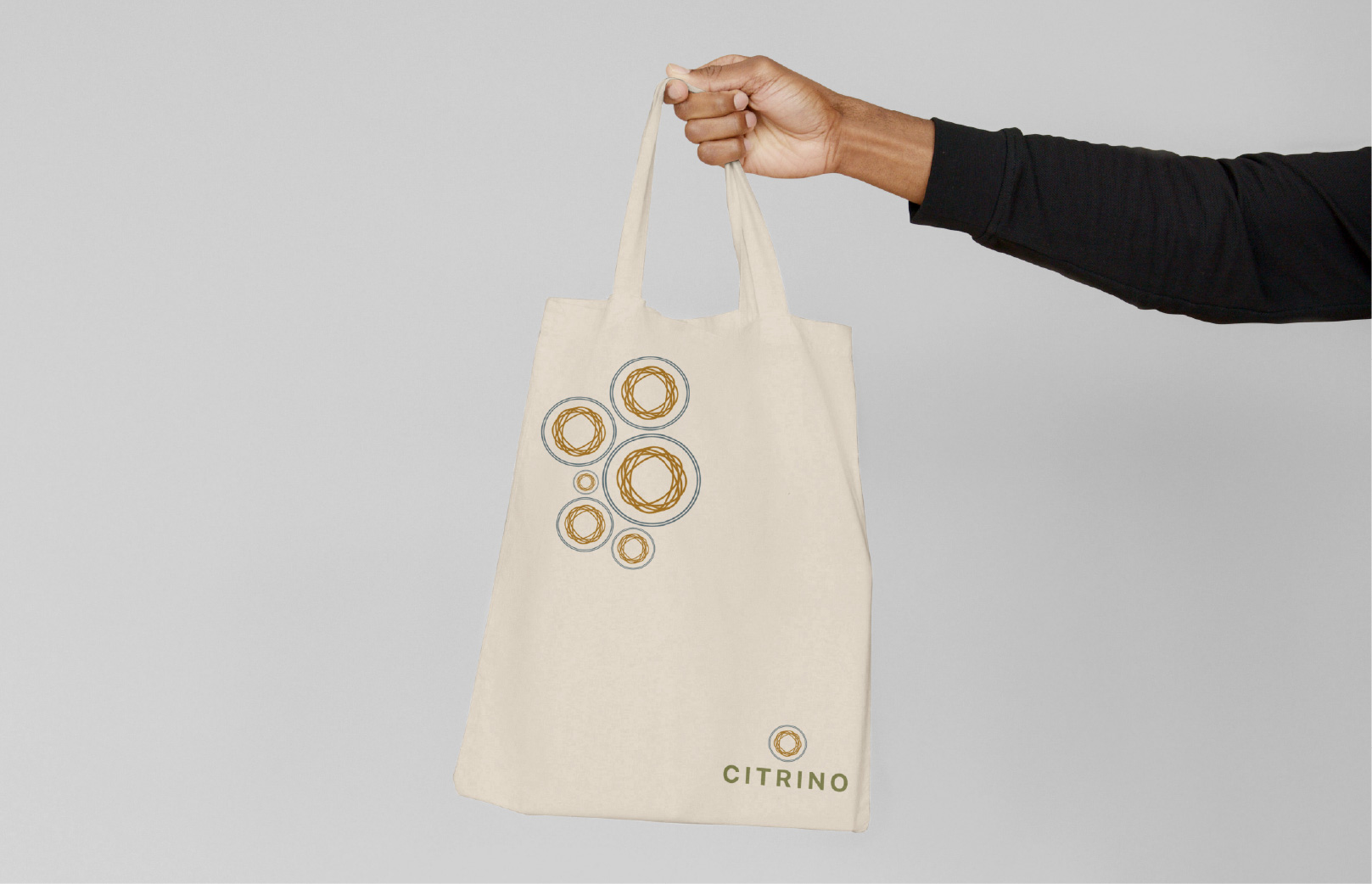
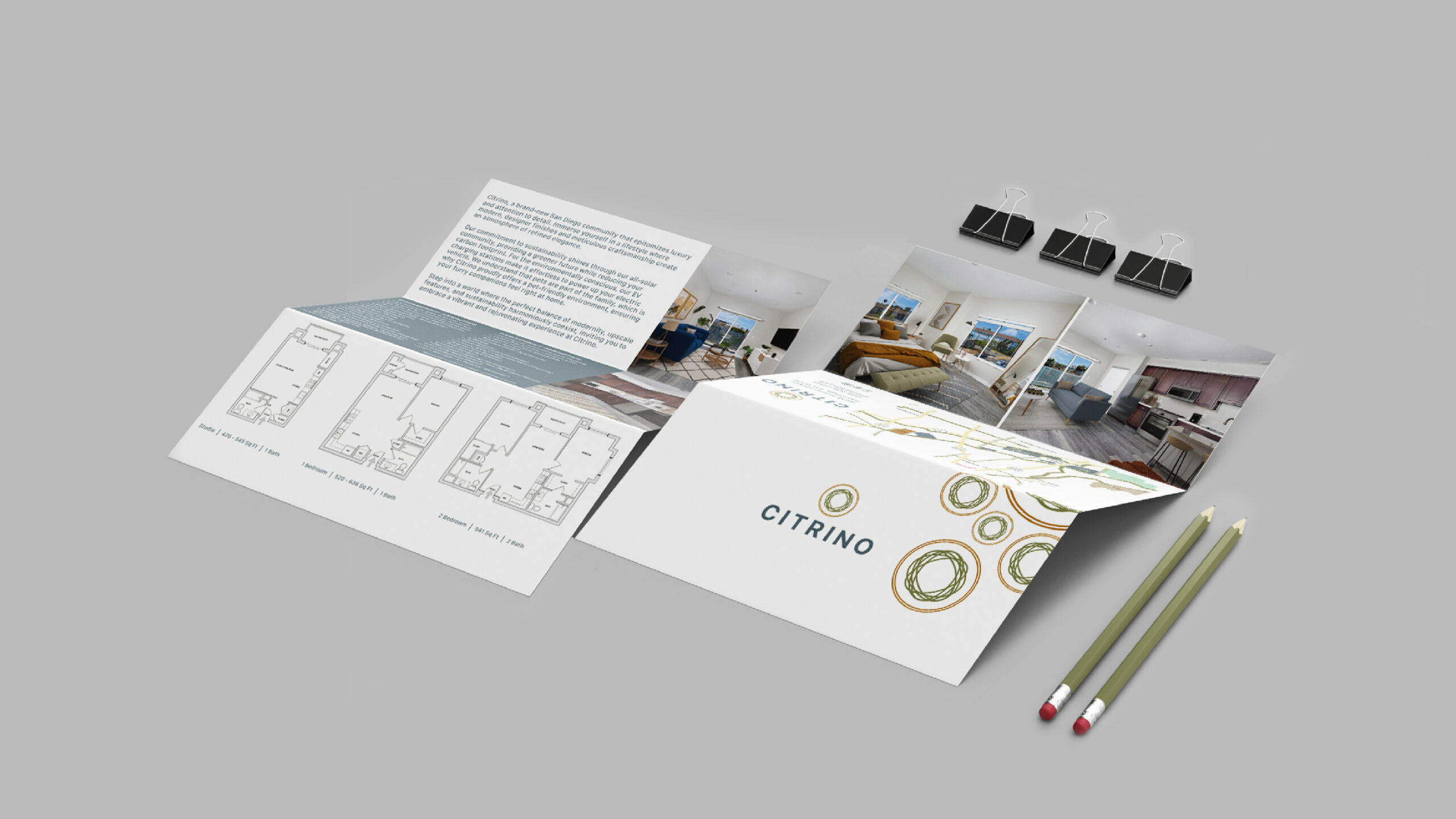
Citrino is a modern apartment community in San Diego’s Linda Vista neighborhood, developed by the Remarc Group and managed by Sunrise Management. Created for residents who value balance, comfort, and quality, Citrino blends eco-conscious design with everyday convenience. oh dang! crafted a brand identity that captures clarity, connection, and creativity—without leaning on the obvious citrus clichés.
The Challenge
The client wanted a name-inspired identity that felt refined and timeless—not literal or predictable. The logo needed to convey warmth and modernity while representing community and quality. The goal: create a sophisticated identity that would appeal to young professionals and students nearby, while communicating balance, quality, and convenience.
The Approach
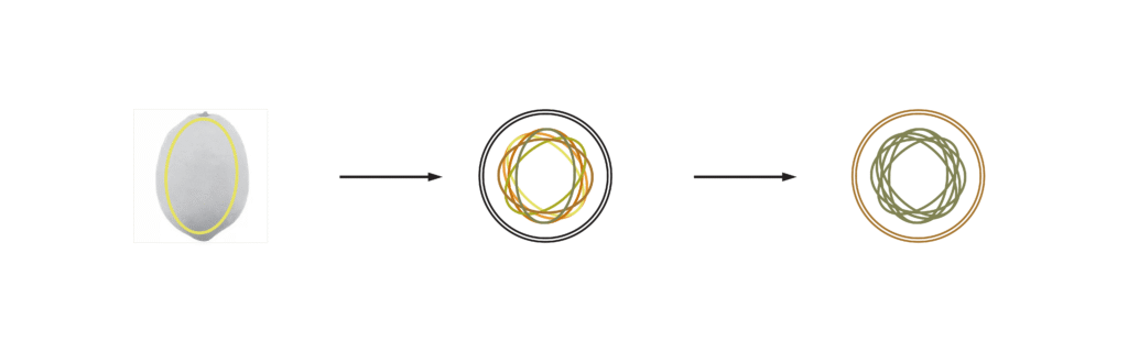
I explored the organic forms found in nature—specifically the subtle geometry within citrus cross-sections. From there, I developed an abstract mark made of overlapping ovals, symbolizing connection and community. An earthy, muted palette grounds the design and ties it back to the property’s natural materials and sustainable focus. Paired with clean, modern typography, the identity strikes a balance between contemporary design and organic warmth.
The Outcome
The final brand is understated yet distinctive—a visual reflection of the property’s philosophy: simple, modern living rooted in quality. The system extended across all touchpoints, from signage and marketing collateral to floor plans and digital assets. With its timeless aesthetic and flexible system, the result is a cohesive identity that elevates the Citrino brand — sophisticated, simple, and full of life.
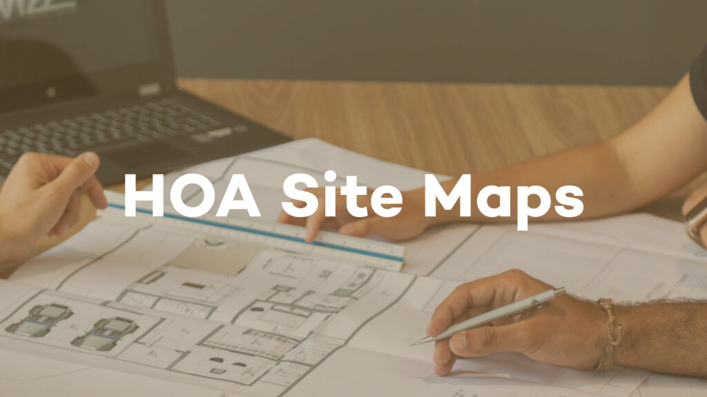
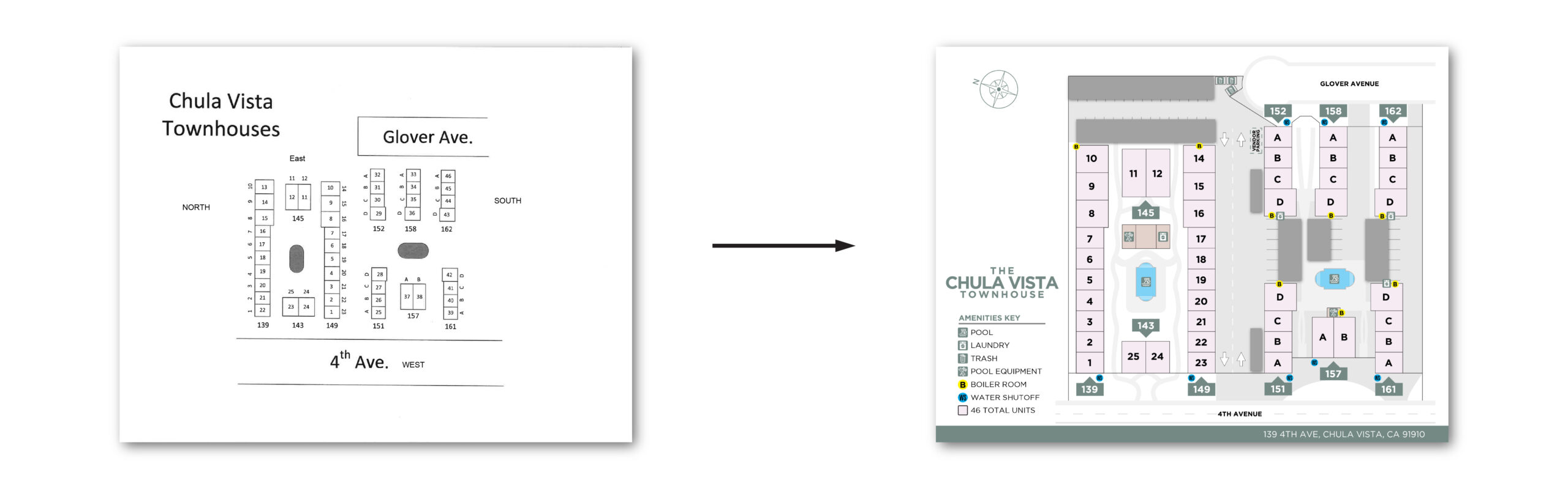
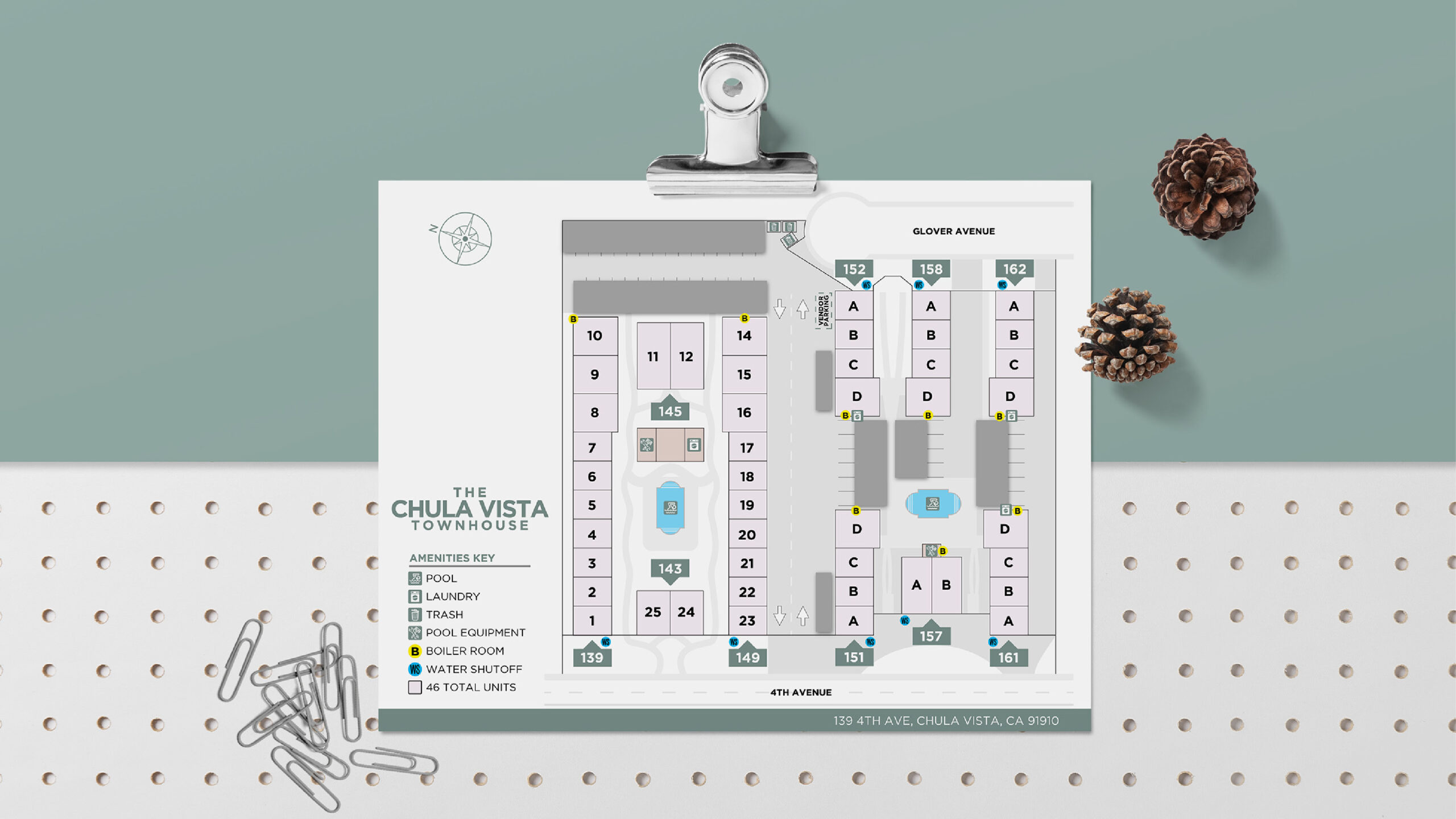
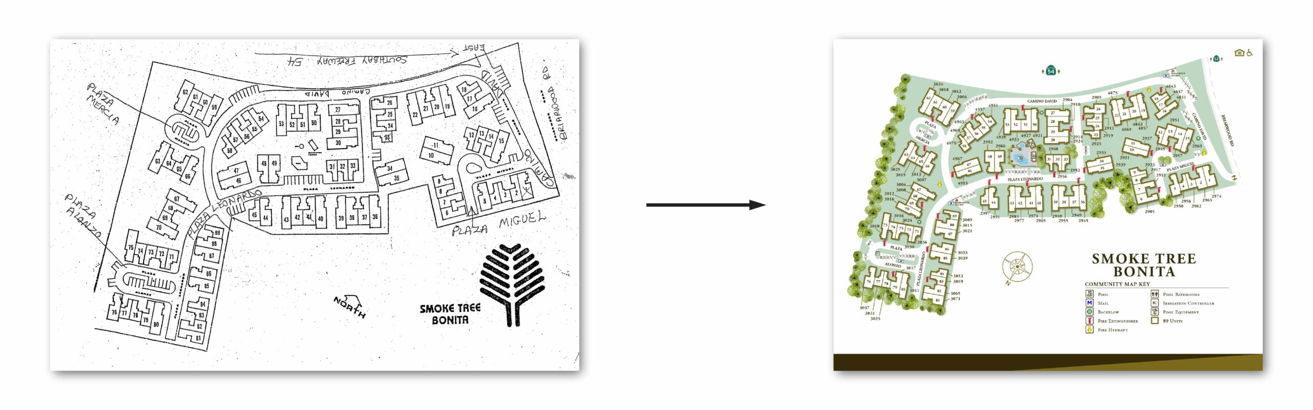
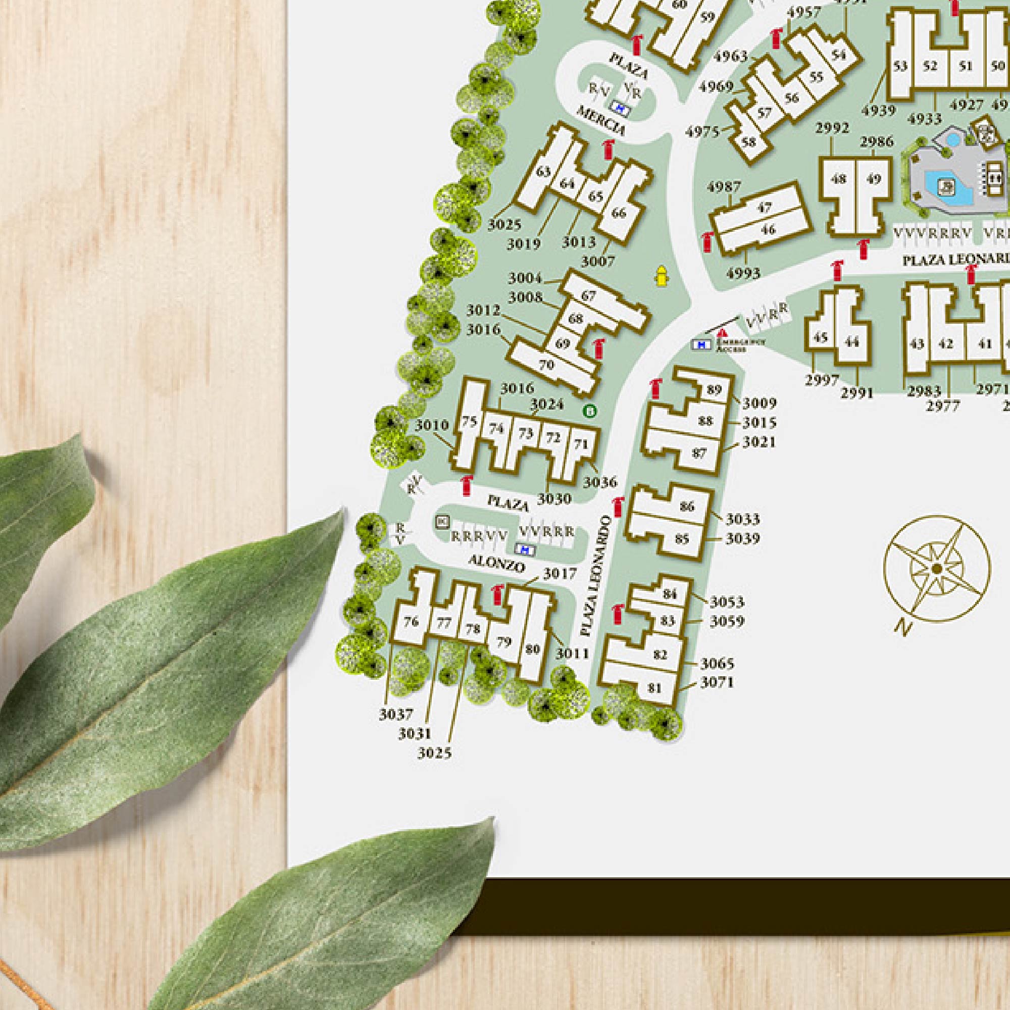
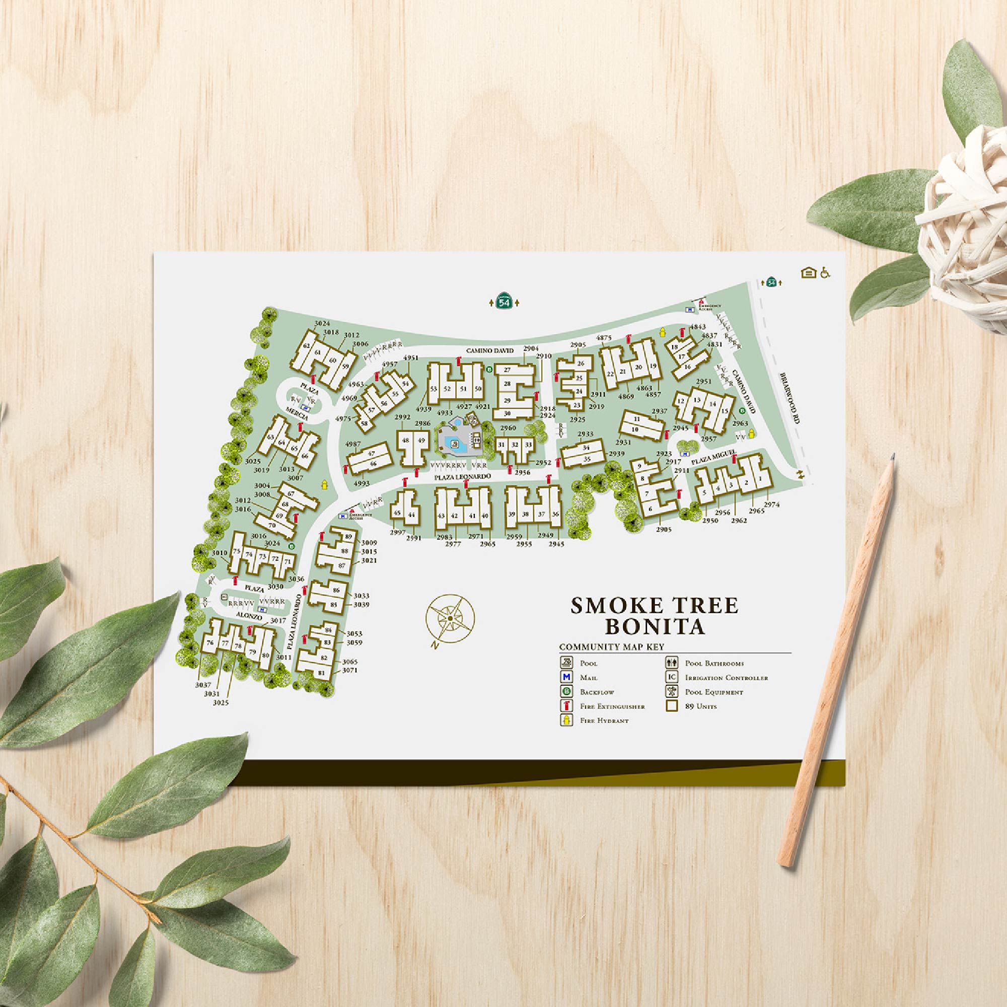
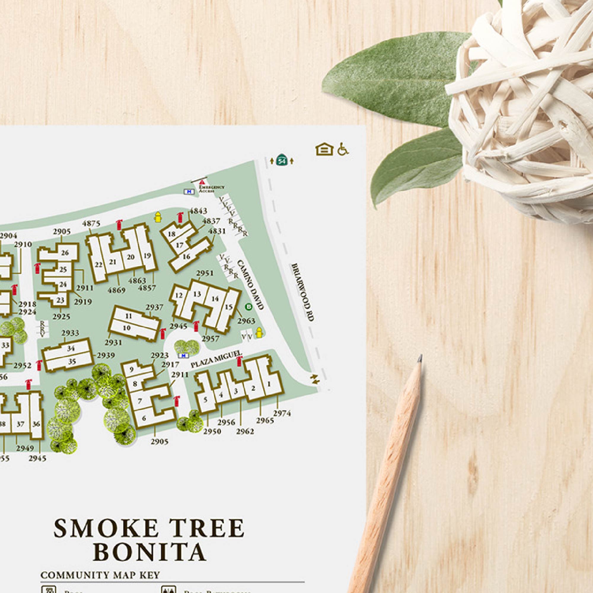
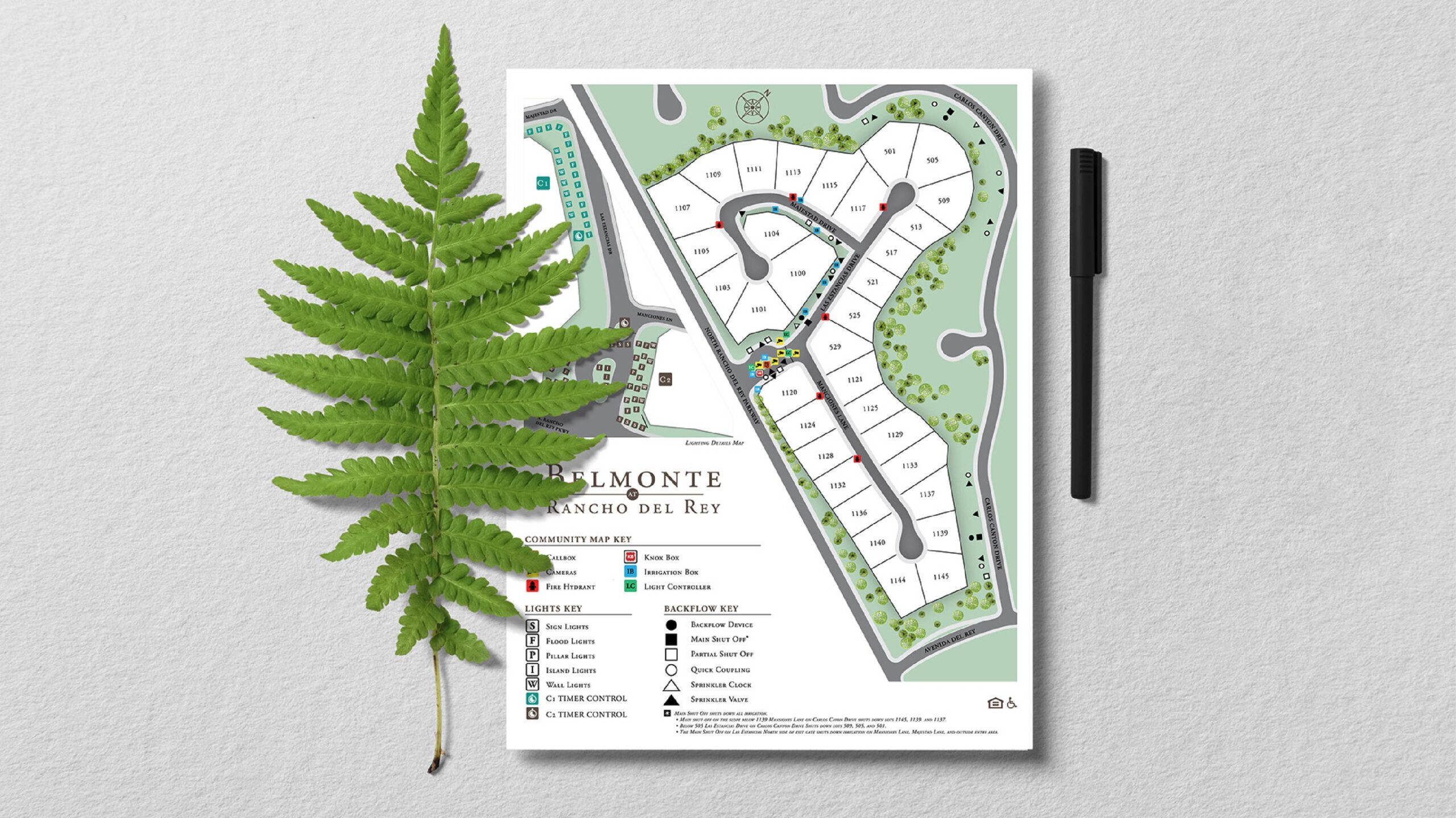
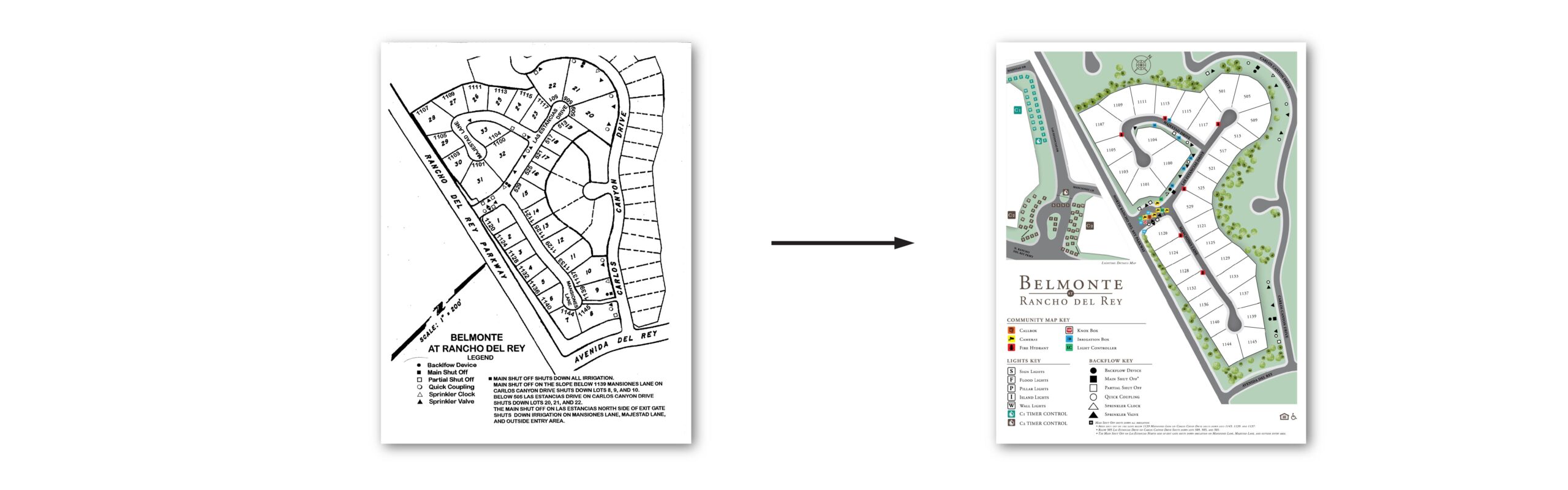
Tyco Property Management—a leading provider of HOA and multifamily management across San Diego—engaged oh dang! to tackle a mission-critical problem: outdated, dysfunctional site maps. We stepped in to refresh and modernize their HOA community maps, transforming outdated visuals into clear, functional tools that dramatically improve workflow for property managers, maintenance teams, and vendors.
The Challenge
Many of Tyco’s existing site maps were outdated, inconsistent, or difficult to read. These maps serve as critical tools for vendors and maintenance teams, yet they often lacked clarity when identifying essential mechanical elements like water shut-offs, sprinkler valves, or main water lines. The challenge was to create maps that were not only visually clear and brand-consistent, but also functional and easy to update as communities evolved.
The Approach
Working closely with Tyco’s property managers and maintenance teams, oh dang! built a collaborative process that blended precision and practicality. Using aerial imagery, existing blueprints, and on-the-ground feedback, each map was redrawn to reflect current layouts and highlight key infrastructure. Visual hierarchy, consistent labeling, and a modernized design system ensured that every detail—from amenities to access points—was clear and intuitive.
The Outcome
The new site maps provided Tyco with a cohesive, accurate, and easy-to-navigate toolset that supports both internal teams and external vendors. By combining form and function, the updated designs improve communication, reduce maintenance confusion, and strengthen Tyco’s professional presentation when working with HOA boards and community partners.
Services
Site Map Redesign Functional Wayfinding Graphics
Your turn. Let’s create something that stands out (and rents fast).
Let’s bring your community’s story to life with thoughtful design and strategy.
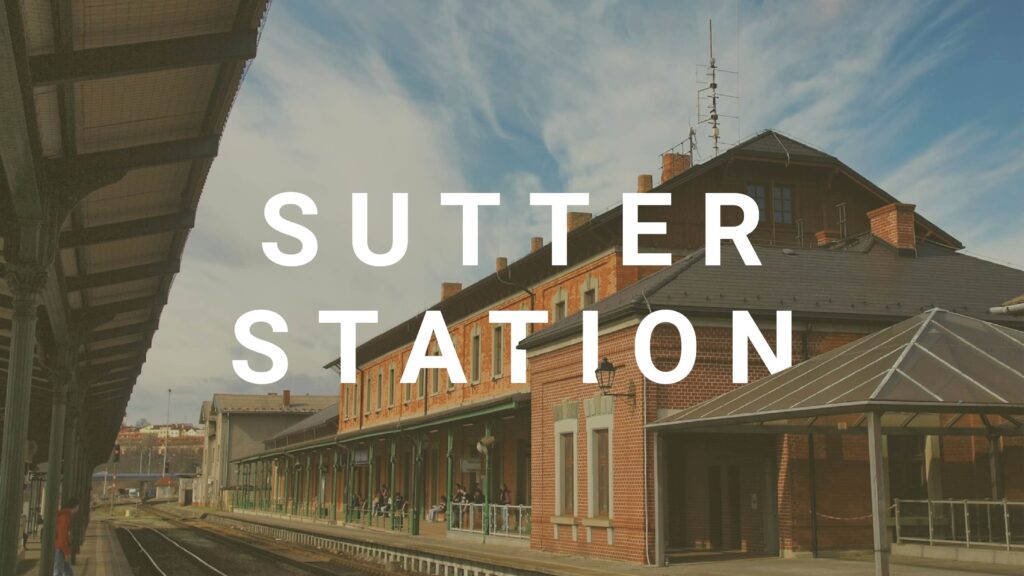
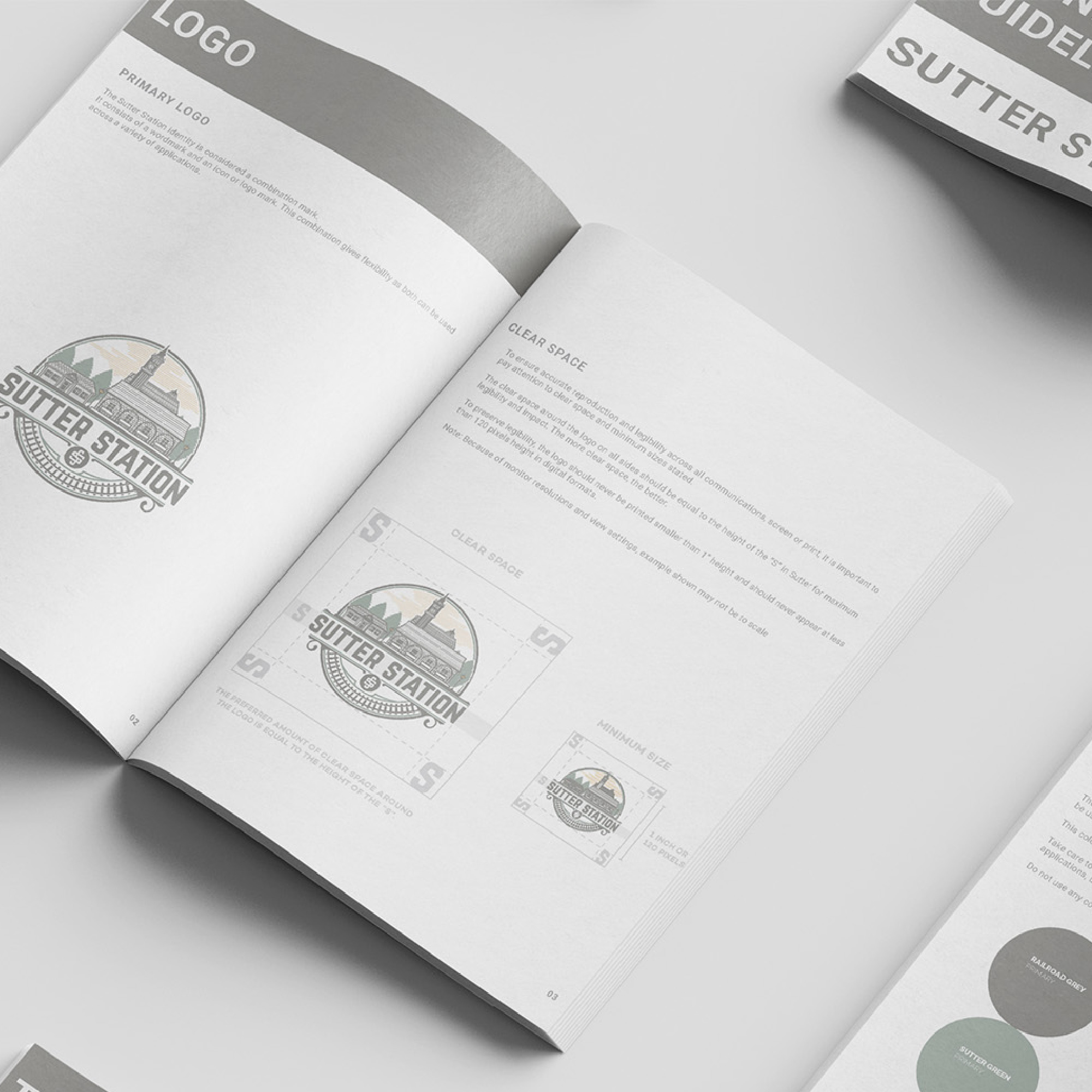
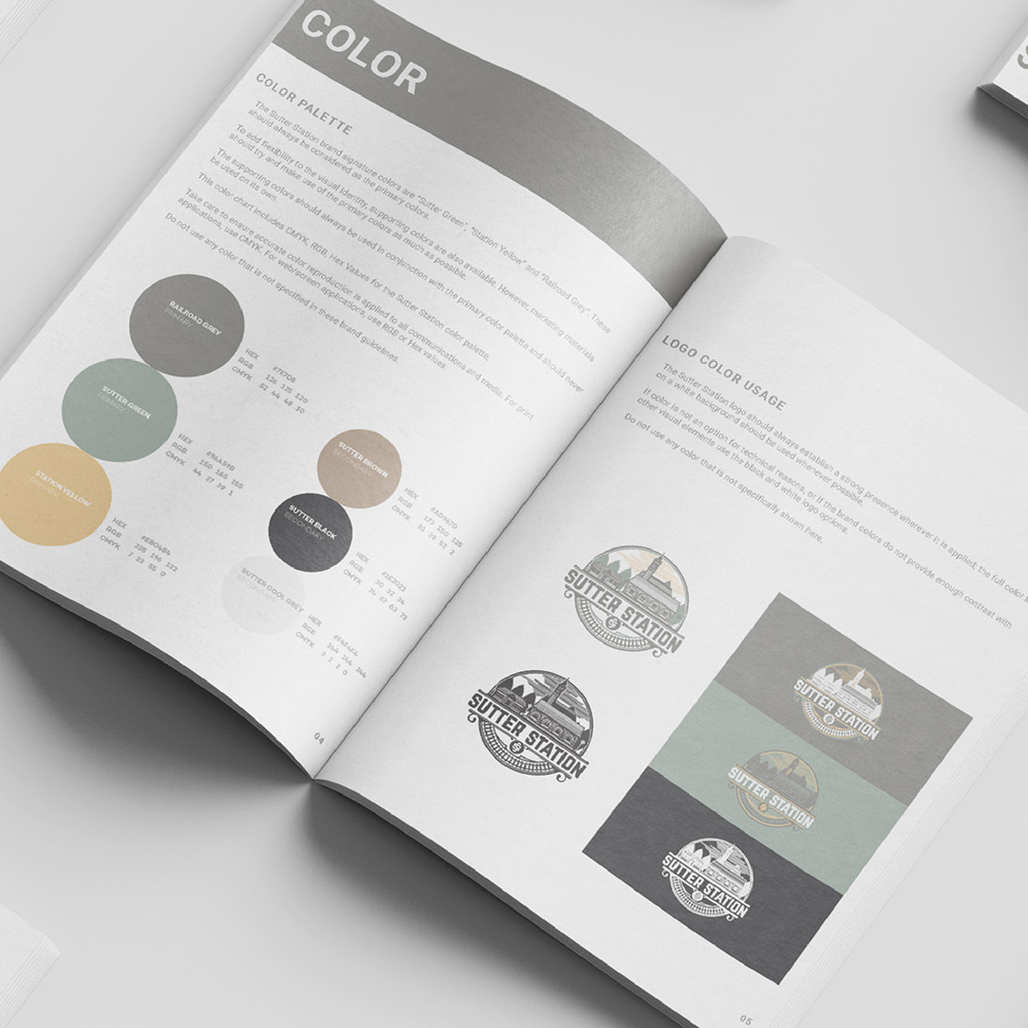
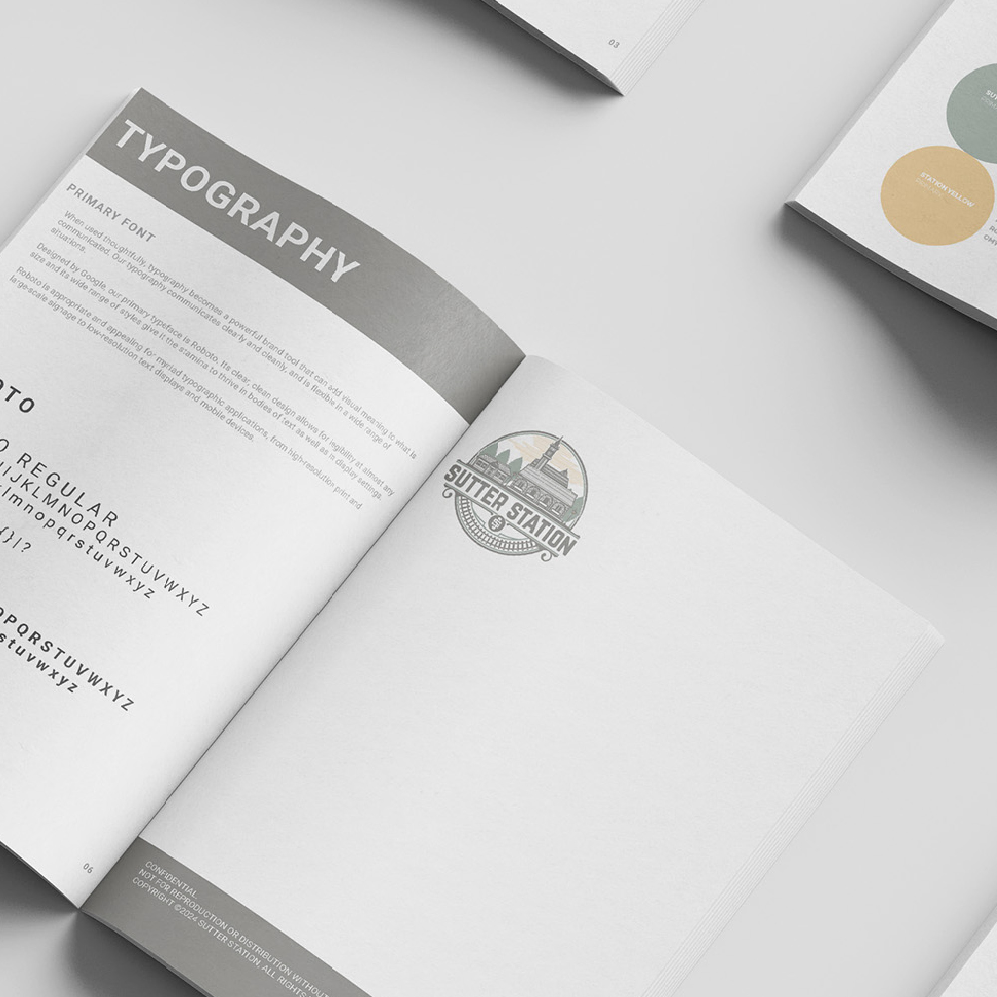
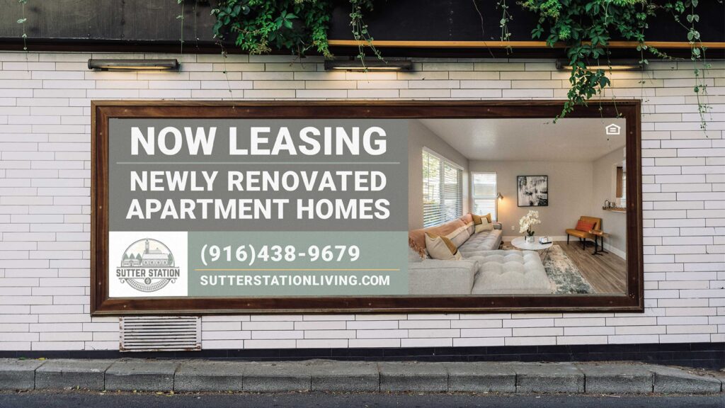
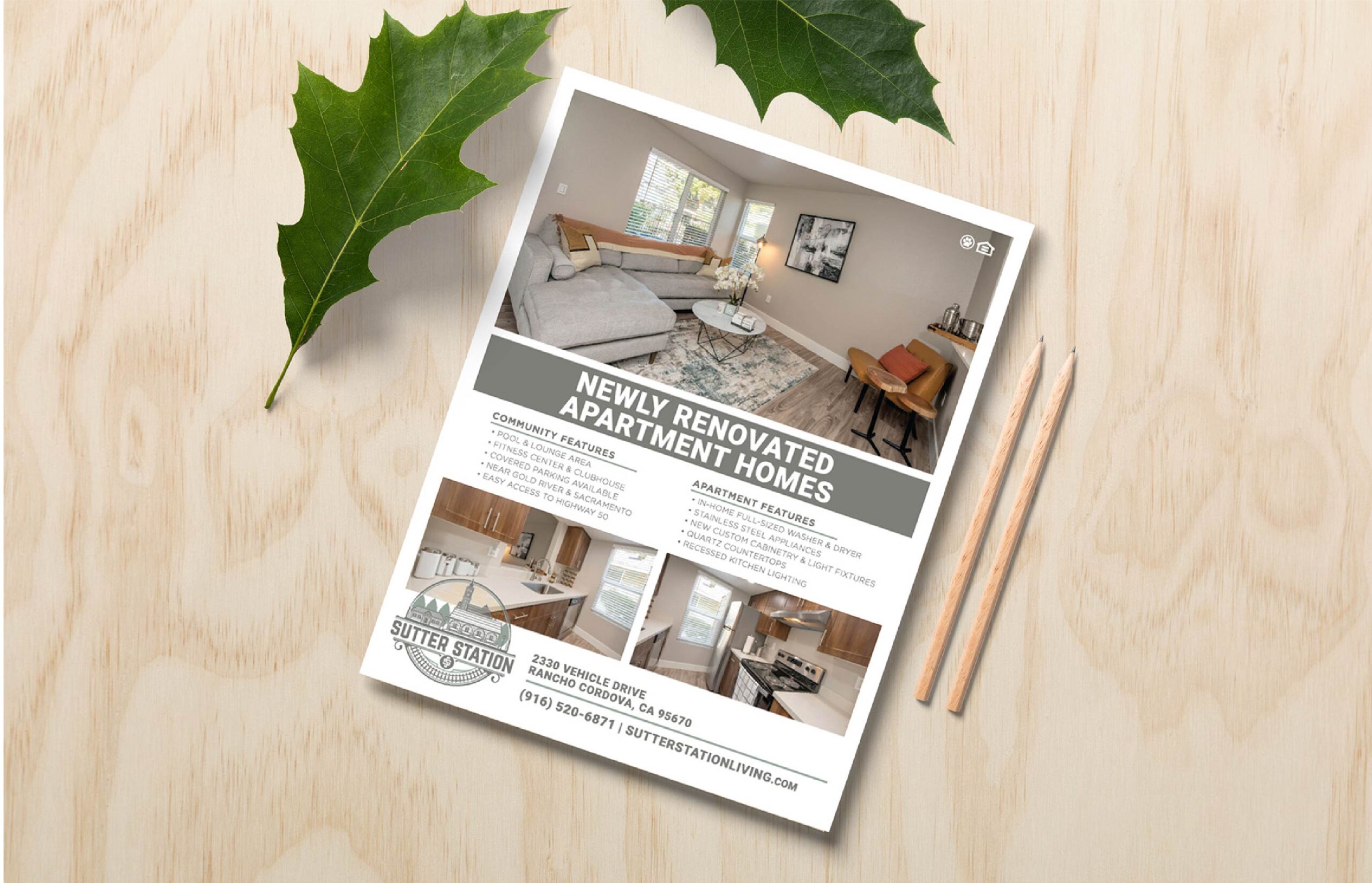
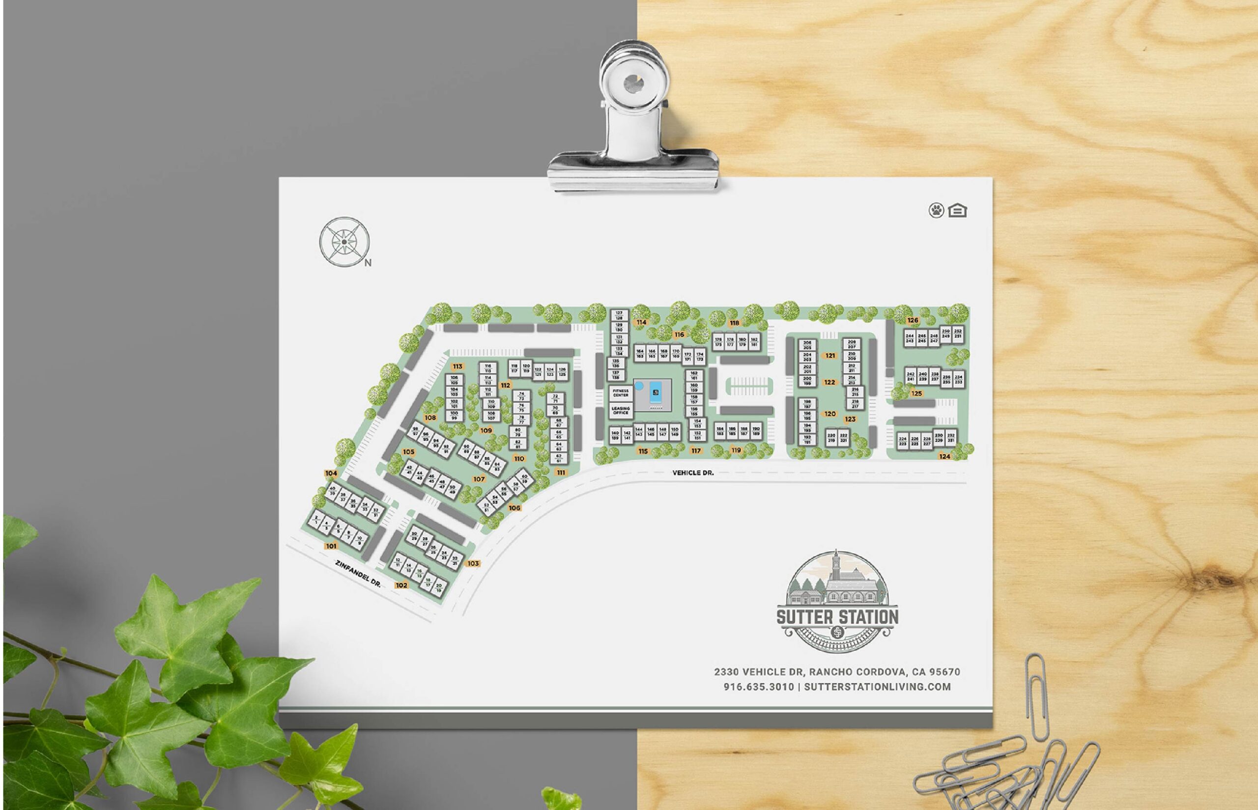
Sutter Station is a revitalized apartment community in Sacramento, originally built in 1986 and now reimagined for a new generation of residents. CloudTen Residential partnered with oh dang! to bring cohesion, color, and strategy to the property’s rebrand—transforming an inherited black-and-white logo into a full, polished brand system ready for rollout across digital and print touchpoints.
The Challenge
The community’s original identity, “Blairmore,” no longer reflected its vision or appeal. During the rebrand, ownership introduced a new logo from a separate designer, creating a fragmented brand foundation. The challenge was to craft a complete identity system—from colors and typography to tone and marketing materials—that could bring cohesion, warmth, and modern appeal to a logo that arrived without context or flexibility, all while partnering closely with CloudTen to define the property’s new aesthetic.
The Approach
Working from the provided logo, I developed a complete brand identity system—selecting typefaces, color palettes, and applications that conveyed approachability, calm, and trust. The chosen palette of ‘Sutter Green,’ ‘Station Yellow,’ and ‘Railroad Grey’ became the foundation of a timeless system. This was more than just picking colors; it was a strategic choice to anchor the brand in classic rail motifs and Northern California’s natural tones, giving the inherited logo a deep sense of place and narrative. Roboto, chosen for its versatility and legibility, provided a modern contrast to the historical aesthetic. From there, I built supporting assets including brand guidelines, print collateral, and on-site materials to ensure cohesive application across every touchpoint.
The Outcome
The completed brand system unified Sutter Station’s visual presence and set the tone for its reintroduction to the market. With clear, consistent design across print and digital materials, the community now reflects its refreshed lifestyle—modern, inviting, and connected. The identity not only brought structure and polish to a disjointed starting point but also positioned Sutter Station as a desirable destination for Sacramento renters seeking quality and character.
Services
Brand Identity Development Brand Guidelines Site Map Exterior Banners Print Collateral Design
Your turn. Let’s create something that stands out (and rents fast).
Let’s bring your community’s story to life with thoughtful design and strategy.
Quick summary of project – Lorem ipsum dolor sit amet, consectetuer adipiscing elit, sed diam nonummy nibh euismod tincidunt ut laoreet dolore magna aliquam.
The Challenge
Lorem ipsum dolor sit amet, consectetuer adipiscing elit, sed diam nonummy nibh euismod tincidunt ut laoreet dolore magna aliquam erat volutpat. Ut wisi enim ad minim veniam, quis nostrud exerci tation ullamcorper suscipit lobortis nisl ut aliquip ex ea commodo consequat. Duis autem vel eum iriure dolor in hendrerit in vulputate velit esse molestie consequat, vel illum dolore eu feugiat nulla facilisis at vero eros et accumsan.
The Approach
Lorem ipsum dolor sit amet, consectetuer adipiscing elit, sed diam nonummy nibh euismod tincidunt ut laoreet dolore magna aliquam erat volutpat. Ut wisi enim ad minim veniam, quis nostrud exerci tation ullamcorper suscipit lobortis nisl ut aliquip ex ea commodo consequat. Duis autem vel eum iriure dolor in hendrerit in vulputate velit esse molestie consequat, vel illum dolore eu feugiat nulla facilisis at vero eros et accumsan.
The Outcome
Lorem ipsum dolor sit amet, consectetuer adipiscing elit, sed diam nonummy nibh euismod tincidunt ut laoreet dolore magna aliquam erat volutpat. Ut wisi enim ad minim veniam, quis nostrud exerci tation ullamcorper suscipit lobortis nisl ut aliquip ex ea commodo consequat. Duis autem vel eum iriure dolor in hendrerit in vulputate velit esse molestie consequat, vel illum dolore eu feugiat nulla facilisis at vero eros et accumsan.
Services
Lorem ipsum dolor sit amet, consectetuer adipiscing elit, sed diam nonummy nibh euismod tincidunt ut laoreet dolore magna aliquam erat volutpat. Ut wisi enim ad minim veniam, quis nostrud exerci tation ullamcorper suscipit lobortis nisl ut aliquip ex ea commodo consequat. Duis autem vel eum iriure dolor in hendrerit in vulputate velit esse molestie consequat, vel illum dolore eu feugiat nulla facilisis at vero eros et accumsan.
Your turn. Let’s create something that stands out (and rents fast).
Let’s bring your community’s story to life with thoughtful design and strategy.